Holiday in Veere / Styleguide
Coastal minimal (locked)
White base, soft blue-gray borders, and a muted sea accent. Inter for everything.
Typography
Hero
Rustig verblijf in Veere, met stijl.
Body
Minimal, helder en heel modern. De content en foto's dragen de sfeer.
Buttons
Full-width section — solid
Solid sand band
Uses the same light blue-gray token as borders (sand) but applied full width.
Notes
- • Background:
bg-sand/60 - • Hairline borders:
border-y border-ink/10 - • Clean separation for long pages
- • White cards keep contrast
White section
Pure white content section
This is what the page feels like without a background band—very clean, very minimal.
Full-width section — gradient
Subtle white → sand gradient
Same palette, softer transition. Often feels more premium than a flat stripe.
Notes
- • Background:
from-white via-sand/30 to-sand/70 - • Hairline borders:
border-y border-ink/10 - • Feels lighter than solid sand
- • Still breaks up the page rhythm
White section (between bands)
Clean reset before the photo band
Adding a white section here keeps the rhythm consistent and makes the photo band feel like a deliberate highlight.

Full-width section — image
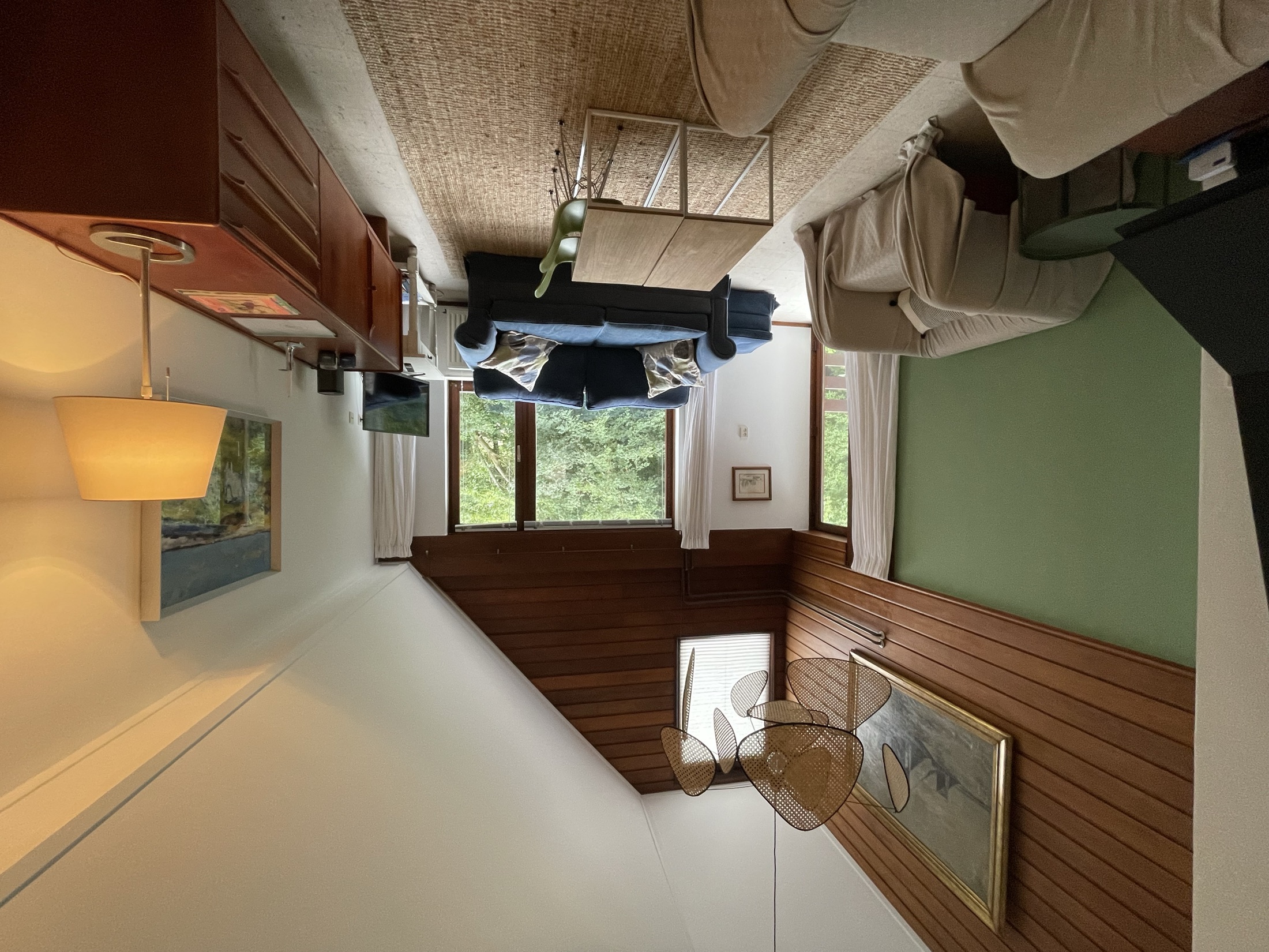
Photo band (readable overlay)
Photo bands look great for holiday rentals, but readability can suffer on mid-tone images. A translucent surface keeps it crisp.
Notes
- • Image:
living-room-13.webp(+ jpg fallback) - • Overlay:
from-white/65 via-white/35 to-sand/55 - • Text surface:
bg-white/85+ blur - • Hairline borders:
border-y border-ink/10
Grid
Gratis parkeren
Aanrader.
3 slaapkamers
Ruim & licht.
Dicht bij Veere
Alles dichtbij.